
Process infographics
Science and citizenship: the water cycle, photosynthesis, digestion, how a bill becomes law. Numbered stages with one thing happening in each, and the loop closed if the process is a cycle.
Build the diagram while you explain it. The water cycle assembles itself on the board, the numbers count up, and nobody has to squint at a printout — or hand the whole thing to the class and let them make one, which is where the learning actually is.
What people make here
One idea per sheet, built in the order you would say it out loud.
Parts arrive one at a time, so a class watches it being made rather than staring at a finished picture.
A school project with its sources on the sheet, or how the class did in something a parent can open on a phone.
The format
An educational infographic is one sheet built to leave a learner with a single idea — how a cycle works, when something happened, what the parts of a thing are, what the numbers came out as. It differs from the business and marketing kind in what it is for. Those exist to persuade or to report; this one exists to be understood, and later to be remembered, which changes what belongs on it. Fewer claims, in an order somebody could say out loud, with the hard word defined on the sheet rather than assumed.
Two people search for this and they want opposite things. A teacher wants something to explain with, or to pin up, or to send home. A student wants to make one, because it has been set as a project and it is being marked. Both are served here, but the second is the more interesting case: assembling the sheet is where most of the learning happens, because a fixed frame forces the decisions — what the point actually is, which three facts support it, what gets cut — that reading a finished one lets you skip.
Educational content maps onto shape more cleanly than any other use case, because a syllabus is already organised by what the material is doing. Start from the subject.
Science and citizenship: the water cycle, photosynthesis, digestion, how a bill becomes law. Numbered stages with one thing happening in each, and the loop closed if the process is a cycle.
History, literature, geology. Dated events on a spine, with the gaps drawn to scale — which is where most classroom timelines go wrong, because evenly spaced events teach the wrong thing about pace.
The parts of a cell, key terms, the causes of something, a revision sheet. Numbered, one line of explanation each, and ordered by importance rather than by the order the textbook happens to use.
Two texts, two organisms, two systems of government, then and now. Same rows down every column, so the difference is visible rather than described.
Data handling, experiment readings, survey results, how the class did. One headline figure with the rest ranked underneath, and the sample size kept on the sheet.
Not screenshots. Each of these is a real piece, drawn in your browser by the same thing that will draw yours.
The same water, going round again
It has been doing this for about four billion years.
Cubic km evaporated a year
Days a drop spends in the air
Of it is in the sea
Is fresh and reachable
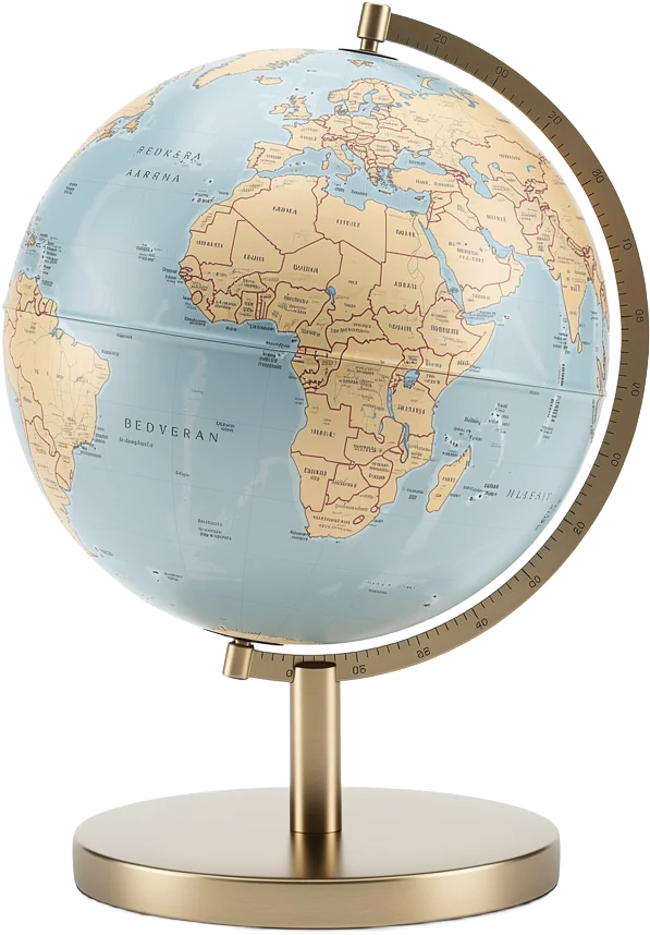
A lesson that builds itself on the board
Everyone moved up at least one grade
Average grade
Up from 5.1 in the autumn
Results without a spreadsheet
More people are reading again
Borrowing has climbed every month since the refit.

Books borrowed this year
Up 41% on the year before
A library year, told as a line
Four parts do almost all of the work
Nucleus
Keeps the instructions and hands out copies.
Mitochondria
Turns sugar into the energy everything else spends.
Ribosomes
Read the instructions and build proteins from them.
Membrane
Decides what gets in and what stays out.
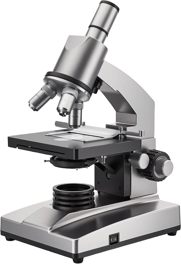
The parts, and what each one does
We stopped setting it on a Friday
Autumn term
Spring term
Nothing else changed. We moved the day, and a third of the problem went away.
One change, measured
A million people, without a single engine
People in the city by AD 100
Aqueducts feeding it
Seats in the Colosseum
Km of road, end to end
753 BC — a village on a hill
A few hundred people beside a river crossing.
312 BC — the first aqueduct
Water arrives, and the city can finally grow.
AD 80 — the Colosseum opens
Room for a twelfth of the city at once.
AD 410 — the walls are breached
The first time in eight hundred years.
A history lesson with a spine
Figures are illustrative and the organisations are invented. The pieces are not.
One sheet built to leave a learner with a single idea — a process, a sequence of events, the parts of something, or what a set of numbers came out as. The difference from a business or marketing sheet is the purpose: this one has to be understood and then remembered, so it carries fewer claims, in a sayable order, with unfamiliar terms defined on the sheet rather than assumed.
This is a school-syllabus question rather than a design one — infographics turn up in Indian Class 6 work in two places, maths data handling and English language. The answer being looked for is the plain one: an infographic is information drawn rather than written, using charts, icons, short labels and a clear order so the point can be taken in at a glance. The types usually listed are statistical, process, timeline, comparison and list. If it is being set as homework, making one from your own data — how the class travels to school, say — will teach more than copying a definition.
Decide the one sentence it has to leave behind before you open anything. Then gather three to six facts that support it, with a source for each, because the source line is what separates a project from a poster. Paste them in and a first draft comes back composed, with the numbers already placed; then cut it until only the sentence and its support remain. Two things get marked down and both are avoidable: numbers with no source and no date, and a sheet that is really three sheets stapled together.
Three ways, in rough order of how well they work. As something built in front of the class rather than shown finished, so the diagram assembles a part at a time while you talk over it and nobody reads ahead. As a revision sheet at the end of a topic, which is where the one-idea rule matters most. And as the assignment itself, which is the version that does the most work, because the person making it has to decide what the topic was actually about.
Not automatically, and the reason usually given for them is the weakest part. The visual-learner idea that several pages on this subject lean on — that some students are wired for pictures and should be taught in pictures — has not held up when it has been tested, and it is worth dropping. What is better supported is narrower and more useful: a diagram helps when the thing being learned is genuinely spatial, sequential or comparative, and it helps most when the learner builds it rather than receives it. So set it as work more often than you hand it out, and do not expect a sheet to carry a first explanation of something complicated — it is better at organising and reviewing material somebody has already met.
Not directly — there is no PDF export here. What you get is a PNG, the sheet as a self-contained web page, and a share link. If a submission portal insists on a PDF, open the share link and print it to PDF from your browser, which produces a normal one-page file. For handing something in, a PNG dropped into the document you are already submitting is usually simpler.
Yes, as an image. There is no .pptx export, so the sheet goes onto a slide as a PNG rather than as editable shapes — which for a lesson is generally what you want, because it stays exactly as composed instead of being reflowed. Choose the wide shape before it composes and it lands at 16:9 with nothing cropped.
No, and it is worth being clear about the difference. The pieces here animate — a diagram assembles a part at a time, figures count up, and you can export that as a video — but nothing on them is clickable. If you need hotspots, buttons a pupil presses to reveal an answer, or an embedded quiz, that is interactive-content territory and tools like Genially are built for it. What you get here is a sheet that explains itself in an order, which is a different and simpler thing.
Yes. A3 is the size most classroom walls get, and the poster page has the resolution arithmetic for each paper size, including where the ceiling is. Two things worth knowing before you send it: the best-quality download is a paid feature, and there is no vector export, so proof one at A4 before printing a set.
Free to try, and the limit matters here more than on any other page, so plainly: the free plan needs no card and is exactly one infographic. That is enough for a student doing one project, and it is not enough for a teacher who wants a sheet per topic or a set for thirty pupils. Paid plans start at about 80 pieces a month and add brand kits, editing by asking, best-quality downloads and removal of the badge. There is no education plan and no school-managed account — no rosters, no school sign-in — so a class set means either individual accounts or a teacher making the sheets.
To view one, no — a sheet somebody shares opens on a link with no sign-in, which is what makes it usable as a handout. To make and download their own, yes: a free account with an email address, no card. Given there is nothing here built for schools, for younger pupils the sensible arrangement is that the teacher makes the sheets and shares the links.
Free to start, no card needed, and nothing to install at either end.